01 — مقدمة ودليل الهوية 01 — Introduction & Guidelines
الدليل المهني لتصميم الهوية البصرية والواجهات Professional Brand & UI Design System Guide
رؤية المطور والمصمم: دليل لغة التصميم الموحدة Designer-Developer Handshake: Unified Design Language Guide
بصفتنا مصممي هوية بصرية وواجهات مستخدم (UI/UX)، نؤمن بأن العلامة التجارية لا تقتصر على مجرد شعار ملون، بل هي نظام متكامل من التفاعلات والخبرات البصرية والمنطقية التي يعيشها المستخدم في كل لحظة. تم إعداد هذا الدليل ليكون الجسر الهندسي والبصري الموحد (Single Source of Truth) الذي يربط بين فلسفة التصميم الإبداعي وهندسة المكونات البرمجية، لضمان واجهات مستخدم متناسقة وسهلة الاستخدام وعالية الأداء عبر جميع شاشات ابتكرجو (IBTKRGO). As brand identity and UI/UX designers, we believe a brand is not merely a colored logomark, but a complete system of visual, physical, and logical interactions experienced by the user. This guide acts as the engineering and visual bridge (Single Source of Truth) connecting creative brand philosophy with reusable component architecture, ensuring a coherent, highly accessible, and performance-optimized experience across all platforms of IBTKRGO.
فلسفة ونبرة الهوية البصرية Visual Brand & Tone Philosophy
تتحرك هوية ابتكرجو البصرية في المنطقة المشتركة بين التعليم الإبداعي والتميز التقني. نعتمد الأشكال الدائرية المتناسقة تعبيراً عن المرونة والاحتضان المعرفي، ونوازنها مع تدرجات اللون الأزرق الرسمي الداكن ليعبر عن الثقة والعمق الأكاديمي، مع تداخل تدرجات البرتقالي الحيوي (Spark Accent) لتعكس روح الابتكار والفضول المعرفي لدى الأجيال الشابة. The visual identity of IBTKRGO operates at the junction of creative learning and technical prominence. We utilize geometric circular curves to symbolize flexibility and cognitive inclusion, grounded in deep academic indigo values representing authority, accented with vibrant orange (Spark Accent) to reflect the curiosity and ingenuity of youth.
هندسة مكونات واجهات المستخدم UI Component Architecture
نعتمد مبدأ التصميم الذري (Atomic Design) لتفكيك الواجهة لمكونات صغرى قابلة لإعادة التكرار والاستخدام. يجب أن تكون عناصر الواجهة (Inputs, Buttons, Cards) متوقعة السلوك، متناسقة الأبعاد، وتتبع أنماط ترشيد المسافات لتقليل العبء المعرفي على المستخدم، مع التركيز على استجابة الحركة (Micro-interactions) لتبدو الواجهات حية ومتفاعلة. We employ Atomic Design principles to deconstruct the interface into modular, reusable components. Interactive controls (Inputs, Buttons, Cards) must be predictable, geometrically balanced, and structured with precise spacing scale to reduce cognitive fatigue, using fluid micro-interactions to make the web app feel responsive and alive.
الوصول الشامل والشمولية (A11y) Universal Accessibility (A11y)
الوصول ليس ميزة إضافية بل هو حق أصيل للتصميم الناجح. يلتزم النظام بمعايير WCAG 2.1 AA لتباين الألوان وسهولة مقروئية النصوص ووضوح مؤشرات التركيز (Focus Outlines) لضمان سهولة التصفح لأصحاب الهمم ومستخدمي لوحات المفاتيح والأجهزة المساعدة بشكل سلس تماماً وبدون عوائق. Accessibility is a fundamental requirement of good design. The system strictly complies with WCAG 2.1 AA contrast metrics, legible hierarchy, and distinct keyboard focus indicators, allowing all users (including those using keyboard-only input or assistive devices) to navigate with absolute clarity.
إرشادات تفصيلية لهندسة عناصر واجهات المستخدم Detailed UI Component Engineering Guidelines
شبكة الأبعاد والمسافات (8px Grid System) Spacing Scales & The 8px Grid System
نعتمد قاعدة شبكة الـ 8 بكسل لحساب كافة الهوامش الداخلية (Padding)، الخارجية (Margin)، والفجوات (Gaps). هذا التوحيد يضمن تدفقاً بصرياً مريحاً للعين وتوازناً متسقاً بين المكونات الرقمية: We mandate the 8px Grid System to calculate all paddings, margins, gaps, and sizes. This scale ensures visual balance and predictable rhythms across different device screens:
- المسافات الدقيقة: 4px أو 8px للفراغات الصغيرة (كالمسافة بين التسمية وحقل الإدخال).Micro spacing: 4px or 8px for tiny gaps (like labels next to fields).
- المسافات العامة: 16px أو 24px للمكونات الداخلية وهوامش التعبئة في البطاقات.Standard layout: 16px or 24px for card padding and inner spacing.
- مسافات الفواصل: 32px أو 48px أو 64px للفصل التام بين الأقسام الرئيسية.Section breaks: 32px, 48px, or 64px to distinguish major screen blocks.
بنية الحالات التفاعلية لعناصر الإدخال (Inputs States) Interactive Component Input States
يجب أن تعبر حالة المكون البصرية عن وضعه التفاعلي بوضوح ودون التباس: The visual properties of form components must accurately communicate their status:
- الافتراضية (Default): حدود رمادية ناعمة وخلفية بيضاء صامتة لتقليل الضوضاء البصرية.Default: Neutral gray border with a clean light backdrop.
- التركيز (Focus): هالة مضيئة باللون الأزرق الداكن `rgba(41, 56, 150, 0.15)` مع إطار واضح لتأكيد التركيز.Focus: Prominent brand blue border with a soft focus glow ring.
- التعطيل (Disabled): رمادي باهت مع شفافية 50% وإلغاء استجابة النقر والمؤشر (not-allowed).Disabled: Grayed out with 50% opacity, disabled actions, and specialized cursor.
دليل التحقق من البيانات وتصميم التنبيهات Validation Feedback & Error Handling
عند تزويد المستخدم بالتغذية البصرية الراجعة حول صحة البيانات المدخلة، اتبع الآتي: When providing users with visual validation feedback on their inputs, strictly follow:
- حالة الخطأ (Error): إطار باللون الأحمر (`#e23d4b`) مع أيقونة التحذير (`fa-circle-exclamation`) وكتابة نص المشكلة بوضوح تحت الحقل مباشرة لشرح كيفية التصحيح. Error State: Red border (`#e23d4b`) accompanied by an exclamation mark icon (`fa-circle-exclamation`) and a helpful descriptive error text rendered below.
- حالة النجاح (Success): إطار باللون الأخضر (`#1e9e6a`) مع أيقونة التحقق بنجاح (`fa-circle-check`). لا تستخدم نصوص نجاح لتجنب إعاقة القراءة. Success State: Green border (`#1e9e6a`) paired with a success check icon (`fa-circle-check`). Keep success message text hidden to avoid layout clutter.
- العناصر الإلزامية (Required): ضع نجمة حمراء (*) وتجنب تقديم تنبيه بالخطأ للمستخدم قبل أن يبدأ بالتفاعل أو يغادر الحقل لأول مرة. Mandatory Fields: Indicate using a red asterisk (*). Do not trigger error states until the user interacts and blurs the input field.
معايير التعريب والتحول البصري والاتجاهات Bilingual Layout Mirroring (RTL/LTR)
لتجنب تداخل النصوص والأيقونات وضمان تجربة طبيعية للمستخدم العربي والإنجليزي، نطبق نظام المحاذاة المرن (Flexbox & CSS Grid) المعتمد على اتجاه المستند (`dir="rtl"` أو `dir="ltr"`): To prevent overlaps and ensure a native reading direction for both Arabic and English visitors, we utilize dynamic flex/grid layouts based on the document's global `dir` attribute:
- محاذاة النصوص: تتجه لليمين في اللغة العربية ولليسار في اللغة الإنجليزية تلقائياً دون أي قيم محاذاة ثابتة.Text Alignment: Aligns right in Arabic and left in English automatically.
- أيقونات التحقق والإظهار: تتموضع في أقصى اليسار في العربية (`left: 0.875rem`) وفي أقصى اليمين في الإنجليزية (`right: 0.875rem`) لتجنب التصادم مع النصوص المكتوبة.Status & Password Icons: Positioned left in Arabic (`left: 0.875rem`) and right in English (`right: 0.875rem`) to prevent text overlaps.
- العناصر المترابطة: يجب أن يعكس ترتيب الأعمدة والأزرار اتجاه القراءة تلقائياً (تغيير ترتيب البطاقات والأعمدة بما يتناسب مع اتجاه العين في كل لغة).Visual Flow: Columns, layouts, and button order mirror naturally based on reading habits.
القواعد الأربعة الذهبية لاستخدام وتطبيق الهوية البصرية The Four Golden Rules of Visual Identity Application
منطقة الأمان للهوامش Clear Space Rule
المساحة الآمنة حول الشعار تعادل حجم الأيقونة الدائرية نفسها. لا تقم أبداً بوضع عناصر أخرى داخل هذه المنطقة. The safe clearance area around the logo is defined by the height of the logomark itself. Never place assets inside this margin.
النسبة الذهبية للأيقونة Logomark Framing
عند تأطير أيقونة التطبيق الدائرية أو متصفح الويب، يجب أن تشغل الأيقونة نسبة 65% من إجمالي مساحة الإطار لضمان التوازن البصري. When packaging the circular app icon or favicon, the core mark must occupy exactly 65% of the bounding frame area for optimal weighting.
المرونة والتعريب Bilingual Assets
يدعم النظام الشعار العربي والإنجليزي. يجب مطابقة اتجاه الشعار والخطوط مع لغة الواجهة الحالية للعميل (RTL للعربية و LTR للإنجليزية). The system supports both Arabic and English assets. Match the logo orientation and typography directly with the active locale (RTL or LTR).
تباين الخلفية والظهور Contrast & Visibility
الشعار الملون يُستخدم فقط على الخلفيات الفاتحة ذات تباين عالٍ. للخلفيات الداكنة، يجب استخدام ملفات المونوكروم (الأبيض بالكامل) لضمان المقروئية. The colored logo must only sit on high-contrast light backgrounds. Use monochrome (completely white) vectors for dark backgrounds to ensure legibility.
02 — الشعارات 02 — Logos
الشعارات Logos
النسخة الملونة — خلفية فاتحة Colored Version — Light Background
الاستخدام الافتراضي على الموقع والمواد ذات الخلفية البيضاء أو الرمادية الفاتحة. Default usage on the website and materials with white or light gray backgrounds.
النسخة البيضاء — خلفية داكنة White Version — Dark Background
ملفات *-monochrome.svg: عناصر
بيضاء بالكامل. لا تُستخدم على خلفية بيضاء.
Files *-monochrome.svg:
Completely white elements. Do not use on a white background.
✓ صحيح — خلفية داكنة ✓ Correct — Dark Background

✓ صحيح — خلفية داكنة أخرى ✓ Correct — Another Dark Background
يعمل على أي خلفية داكنة كافية التباين Works on any dark background with sufficient contrast
✗ خطأ — خلفية فاتحة ✗ Incorrect — Light Background
يضيع الشعار — تجنب الألوان الفاتحة The logo is lost — avoid light backgrounds
✗ خطأ — خلفية زرقاء فاتحة ✗ Incorrect — Light Blue Background
حتى الأزرق الفاتح لا يكفي — يجب أن تكون الخلفية داكنة بما يكفي Even light blue is not enough — background must be dark enough

02.1 — شعار الموشن 02.1 — Logo Motion
شعار الموشن التفاعلي Interactive Logo Motion
شعار العلامة التجارية بحركة بصرية متطورة ومدروسة. يتميز بحركة ظهور متداخلة للأيقونة وحروف الشعار ثم الشعار اللفظي المساعد، مع لوحة تفاعلية تتيح معاينة الحركة بالوضعين الفاتح والداكن ونسخ الكود البرمجي المكتمل لدمجه في التطبيقات والمواقع. The brand logo animated with high-fidelity motion graphics. It features staggered animations for the icon, the wordmark, and the tagline, with an interactive preview card to test light/dark modes, and a code block to copy the full HTML/CSS/SVG code for websites.
المعاينة الحية Live Preview
كود الحركة المكتمل Ready-to-use Code
03 — المساحة الآمنة 03 — Clear Space
الهوامش والمساحة الآمنة Margins & Clear Space
المساحة المحيطة بالشعار = حجم الأيقونة نفسها (وحدة واحدة من Logo icon only.svg). تتكرّر الأيقونة شبحاً في الخلايا المحيطة لتوضيح الهامش — كما في أدلة العلامات العالمية. تنطبق على العربي والإنجليزي وأي لغة. The space around the logo = the height of the icon itself (one unit of Logo icon only.svg). The icon is repeated as a ghost in the surrounding cells to illustrate the margin — as in international brand guidelines. Applies to Arabic, English, and any other language.
الشعار العربي Arabic Logo
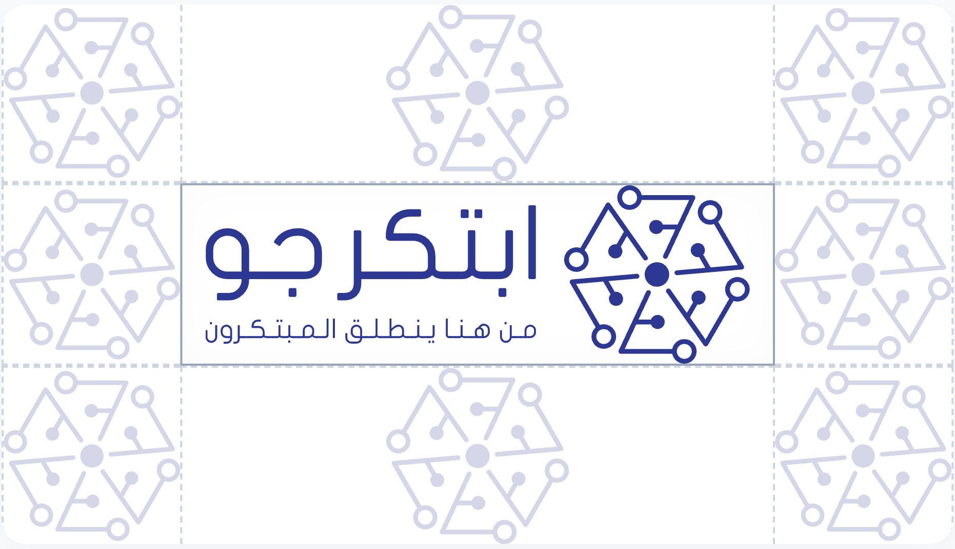
الوسط: الشعار · المحيط: مساحة = حجم الأيقونة Center: Logo · Perimeter: Space = Icon Height
English Logo
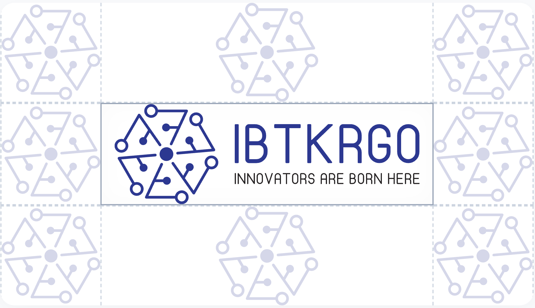
الوسط: الشعار · المحيط: مساحة = حجم الأيقونة Center: Logo · Perimeter: Space = Icon Height
القاعدة باختصار The Rule in Brief
- خذ ارتفاع الأيقونة المعزولة — هذا هو H. Take the height of the isolated icon — this is H.
- اترك فراغاً حول الشعار الكامل بمقدار H من كل جهة. Leave a space around the full logo equal to H on all sides.
- لا يدخل هذا الفراغ أي نص، صورة، أو شعار آخر. No text, image, or other logo should enter this space.
-
في CSS:
padding: var(--unit-icon)حول الشعار. In CSS:padding: var(--unit-icon)around the logo.
04 — الأيقونات 04 — Icons
الأيقونات Icons
قاعدة الـ 65% The 65% Rule
داخل أي إطار دائري أو مربع (تطبيق، favicon، بروفايل)، يشغّل الرمز من Logo icon only.svg 65% من المساحة، مع 17.5% هامشاً من كل جانب. Inside any circular or square frame (app icon, favicon, profile photo), the symbol from Logo icon only.svg occupies 65% of the space, with a 17.5% margin on each side.
 17.5%
17.5%
17.5%
17.5%
17.5%
17.5%
- رمز العلامة: 65% × 65% Brand Symbol: 65% × 65%
- هامش: 17.5% من كل جانب Margin: 17.5% on each side
- مثال 512px: الرمز ≈ 333px، الهامش ≈ 89px 512px Example: Symbol ≈ 333px, Margin ≈ 89px
- نفس النسبة عند تصدير 16px و 512px لاتساق المظهر Same proportion is kept for 16px and 512px for visual consistency
أيقونات المنصات Platform Icons
نفس الرمز — معالجات مختلفة حسب الاستخدام: The same symbol — different rendering according to usage:
تطبيق الجوال Mobile App

خلفية بيضاء White BG
خلفية زرقاء Blue BG
378×378 px
صورة البروفايل Profile Picture

خلفية بيضاء White BG

خلفية زرقاء Blue BG
378×378 px
تبويب المتصفح (Favicon) Browser Tab (Favicon)

وضع نهاري Day Mode

وضع داكن Dark Mode
100×100 px — Chrome & others
أيقونات وسائل التواصل Social Media Icons
علامة مضغوطة (~65px) — للملف الشخصي والروابط الصغيرة: Compressed symbol (~65px) — for profiles and small links:
 Instagram
 Facebook
 X
X
 LinkedIn
 YouTube
 Telegram
 WhatsApp
05 — الخطوط 05 — Typography
الخطوط Typography
يُسْتعمَل خط تجوال (Tajawal) كخط أساسي وموحد لكافة عناصر الهوية البصرية، بما في ذلك العناوين الرئيسية والفرعية، النصوص الطويلة، الفقرات، مكونات واجهة المستخدم، والشعار النصي لضمان مقروئية ممتازة وتناسق بصري تام. The Tajawal font is used as the primary unified typeface for all brand assets, including headings, paragraphs, UI text, and the logotype to ensure perfect readability and visual consistency.
من هنا ينطلق المبتكرون Where Innovators Launch
عربي Arabic
أ ب ت ث ج ح خ د ذ ر ز س ش ص ض ط ظ ع غ ف ق ك ل م ن ه و ي ء ؤ ئ ى
ة
ابتكرجو — نص تجريبي للقراءة والواجهة
إنجليزي English
A B C D E F G H I J K L M N O P
Q R S T U V W X Y Z a b c d e f g h i j k l m n o p q r s t u v w x y z
Innovators
launch from here — UI body text
أرقام وعلامات Numbers & Symbols
0123456789 !@#$%&*()
أوزان Weights
Light · Regular · Medium · Bold · Black
ابتكرجو منصة للمبتكرين. Tajawal يضمن وضوحاً عالياً في الشاشات والمواد التسويقية. IBTKRGO is a platform for innovators. Tajawal ensures high legibility on screens and marketing materials.
يُستخدم JetBrains Mono لعرض الشفرات البرمجية والأكواد والتنسيقات الرقمية الفنية في المنصة لضمان مقروئية مثالية للمطورين والطلبة. JetBrains Mono is used to display source code, scripting, and technical specifications in the platform to guarantee optimal legibility for developers and students.
function initIBTKRGO() {
console.log(`IBTKRGO: ${motto}`);
}
الأحرف البرمجية Monospace Characters
a
b c d e f g h i j k l m n o p q r s t u v w x y z
A B C D E F G H I J K L M N O P Q R
S T U V W X Y Z
الأرقام والرموز الخاصة Numbers & Special Symbols
0
1 2 3 4 5 6 7 8 9
!= == <=>= => -> + - * / && ||
مقياس الخطوط الرقمية (Typography Scale) Digital Typography Scale
الهيكل والتسلسل الهرمي المعتمد لعرض العناوين والنصوص والفقرات التوضيحية في واجهة المنصة: The approved scale and hierarchy for titles, headings, body text, and captions in the platform interface:
| رمز التوكن (Token) Token Name | الوزن / الحجم Weight / Size | نموذج العرض Visual Sample | التنسيق في CSS CSS Format |
|---|---|---|---|
| --text-display | 800 / 56px | ابتكر المستقبل Innovate the Future | font: var(--text-display) |
| --text-h1 | 800 / 40px | تمكين الشباب Empowering Youth | font: var(--text-h1) |
| --text-h2 | 700 / 32px | برامجنا التعليمية Our Educational Programs | font: var(--text-h2) |
| --text-h3 | 700 / 24px | ابدأ رحلتك المعرفية Start Your Knowledge Journey | font: var(--text-h3) |
| --text-body-lg | 400 / 18px | تعلم العلوم والذكاء الاصطناعي مع ابتكرجو Learn Science and AI with IBTKRGO | font: var(--text-body-lg) |
| --text-body | 400 / 16px | جعل تعليم التكنولوجيا متاحاً للجميع بلا استثناء Making tech education accessible to everyone without exception | font: var(--text-body) |
| --text-small | 400 / 14px | مستوى مبتدئ · 6 ساعات تدريبية Beginner level · 6 training hours | font: var(--text-small) |
| --text-caption | 500 / 12px | تسمية توضيحية CAPTION LABEL | font: var(--text-caption) |
06 — الألوان 06 — Colors
الألوان Colors
التدرج الأساسي — الأزرق الرسمي (Indigo Scale) Primary Palette — Indigo Scale
يمثل اللون Indigo 600 (#293896) اللون الرسمي الرئيسي للعلامة التجارية. درجات التفتيح والتعميم مخصصة للخلفيات والمساحات والتفاعلات البصرية. Indigo 600 (#293896) represents the main official color of the brand. Shading and tinting scales are designed for backgrounds, clear spaces, and UI interactions.
لون اللكنة المميز — سبارك (Spark Amber) Accent Color — Spark Amber
يستخدم كلون لهب أو تميز (Accent) لجذب الانتباه كأزرار البدء والتنشيط والتوجيه الفوري. Used as an accent color to capture attention for call-to-actions, activation buttons, and key interactive guides.
لون اللكنة الرديف — سكاي (Sky Cyan) Secondary Accent — Sky Cyan
أزرق سماوي رديف يستعمل لتمييز بعض العناصر كشريط التقدم، شارات المستوى المتوسط، أو ركيزة المجتمع. A secondary sky blue used to highlight specific elements such as progress bars, intermediate badge status, or community-focused components.
الألوان المحايدة — الرمادي البارد (Slate Neutrals) Neutral Tones — Cool Slate Scale
تدرج رمادي بارد مائل للزرقة، مخصص للخلفيات والحدود والتقسيمات والهوامش ونصوص الواجهة والفقرات. A cool bluish-gray palette dedicated to backgrounds, borders, section dividers, margins, body copy, and UI text elements.
ألوان الحالات التنبيهية (Semantic Colors) Semantic States & Status Colors
مجموعة الألوان التوجيهية للإشارة إلى حالة العمليات، مستويات الدروس، والتنبيهات البرمجية والوظيفية في المنصة. A set of functional indicator colors to define processes, course difficulty levels, and system code warnings.
النجاح (Success) Success
#1e9e6a
تنبيه (Warning) Warning
#e6a100
خطأ (Error) Error
#e23d4b
معلومات (Info) Info
#1fa2e0
07 — النظام الهندسي 07 — Spacing & Elevation
التباعد والظلال والزوايا Spacing, Shadows & Radii
مقياس التباعد (Spacing Scale) Spacing Scale
مقياس تباعد هندسي يعتمد على شبكة أساسية بمقدار 4px لتحديد الهوامش الداخلية والخارجية والمسافات بين العناصر لضمان الاتساق الرياضي للواجهات: A geometric spacing scale based on a 4px base grid to define padding, margins, and gaps between elements to ensure visual and mathematical consistency in layouts:
انحناء الأركان (Corner Radii) Corner Radii
يحدد انحناء الأركان درجة انسيابية العناصر الصندوقية والتفاعلية كالأزرار والحقول والبطاقات: Defines the border radius of UI containers and interactive elements like buttons, inputs, and cards:
نظام الارتفاع والظلال (Elevation & Shadows) Elevation & Shadows
نظام ظلال بارد مائل بلون خفيف لعلامة ابتكرجو، يمنح العناصر عمقاً بصرياً واتساقاً جمالياً رفيعاً: A cool, subtle bluish shadow system for IBTKRGO, giving components visual depth and premium consistency:
08 — عناصر واجهة المستخدم 08 — UI Components
عناصر ومكونات الواجهة (UI Components) UI Components & Specifications
1. الأزرار وحالاتها التفاعلية (Buttons & States) 1. Buttons & Interactive States
يتضمن نظام التصميم أربعة أنواع رئيسية من الأزرار مع خيار الأركان الدائرية الكاملة (Pill) ودعم الحالات التفاعلية: The design system includes four main types of buttons with full pill options and complete interactive states support:
أنواع الأزرار (Button Types) Button Types
حالات الزر الرئيسي (Primary Button States) Primary Button States
2. الشارات ورقاقات التصفية (Badges & Chips) 2. Badges & Filter Chips
شارات دلالية ملونة لتحديد مستوى الدورات ومدتها الزمنية، ورقاقات لتصفية المحتوى والفرز البصري: Semantic colorful badges to define course difficulty levels and durations, along with selection chips for content filtering:
3. حقول الإدخال وحالات التحقق (Form Inputs & Validation) 3. Form Inputs & Validation States
تصميم حقول الإدخال التفاعلية مع تأثير التوهج وحلقة التركيز المخصصة، بالإضافة إلى حالات الخطأ والنجاح وحقول الإدخال الإلزامية: Interactive input fields with glow transition and custom active focus ring, along with error/required states and success validation:
4. بطاقات الركائز والدورات (Cards) 4. Pillar & Course Cards
البنية الهيكلية لبطاقات ركائز العلامة التجارية (Pillar Cards) وبطاقات الدورات التدريبية التفاعلية: Structural layout for brand pillar cards and interactive training course cards:
سهولة الوصول Accessibility
جعل تعليم التكنولوجيا متاحاً للجميع بغض النظر عن خلفياتهم. Making technology education accessible to all, regardless of background.
الابتكار Innovation
تعزيز الإبداع وحل المشكلات من خلال التكنولوجيا الحديثة. Fostering creativity and problem-solving through cutting-edge technology.
المجتمع Community
بناء شبكة داعمة من المتعلمين والموجهين والمبتكرين. Building a supportive network of learners, mentors, and innovators.
بطاقة الدورة التدريبية المتكاملة (Full Course Card) Full Course Card Specs
دورة ابتكارات المايكروبيت Micro:bit Innovations Course
مستوى متوسط Intermediate- هندسة التصميم ولوحة تحكم آردوينو Design engineering & Arduino control board
- القطع الإلكترونية والمستشعرات الذكية Electronic parts and smart sensors
- بناء وبرمجة الروبوتات والسيارات المتنقلة Building & programming mobile robots
5. شريط التنقل (Header / Nav) 5. Navigation Header
شريط التنقل المعتمد لعلامة ابتكرجو، يمتاز بخلفية بيضاء شفافة بتبخير بلوري (backdrop-blur) لضمان القراءة المريحة: The approved header navigation bar for IBTKRGO, featuring a translucent glassmorphic backdrop-blur for premium legibility:
09 — الاستخدام 09 — Usage Guide
ما يُمنع Dos & Don'ts
❌ تغيير ألوان الشعار Changing logo colors
✓ استخدم الملفات الرسمية فقط (ملون / monochrome). Only use the official assets (colored / monochrome versions).


❌ تشويه الأبعاد Stretching or distorting
✓ حافظ على نسبة العرض إلى الارتفاع. Always maintain the logo aspect ratio.
❌ رمز أكبر من 65% داخل أيقونة التطبيق Symbol exceeding 65% container in app icon
✓ اترك 17.5% هامشاً — وإلا يبدو مزدحماً عند 16×16. Leave a 17.5% clear space margin — otherwise it looks cramped at 16x16.

❌ تدوير الشعار Rotating the logo
✓ الشعار يُستخدم دائماً أفقياً بدون أي تدوير. The logo must always be used horizontally with no rotation.
❌ قلب الشعار أو عكسه Flipping or mirroring
✓ لا تعكس الشعار أفقياً أو رأسياً — الاتجاه جزء من هويته البصرية. Do not mirror the logo horizontally or vertically — orientation is key to its identity.
❌ إضافة ظلال أو تأثيرات بصرية Adding shadows or visual effects
✓ لا تُضف ظلاً أو توهجاً أو تأثيرات على ملفات الشعار الرسمية. Do not add dropshadows, glows, or any other styling effects to the logo.
❌ تغيير نسبة الأيقونة إلى النص Changing symbol-to-text proportions
✓ الشعار وحدة متكاملة — لا تُكبّر الأيقونة أو النص بشكل مستقل. The logo is a single locked unit — do not resize the icon or wordmark independently.
❌ اختراق المساحة الآمنة بنصوص أو عناصر Intruding on the clear space
✓ أبقِ فراغاً حول الشعار يساوي H من كل جهة — لا عناصر داخل المساحة الآمنة. Maintain a clear space around the logo equal to 1 H unit on all sides.
نص آخر
Other Text
❌ إضافة كلمات أو شعارات إلى الشعار Adding words or secondary slogans to the logo
✓ لا تُضف كلمات كـ "الرسمي" أو "™" أو أي عنصر داخل ملف الشعار نفسه. Do not append text like "Official" or "™" or any other graphic to the logo file.
الرسمي™
OFFICIAL™
10 — التحميل 10 — Download Kit
تحميل الملفات Downloads & Brand Kit
الحزمة الكاملة (Brand Kit) Full Brand Kit Package
حمل جميع الشعارات، الأيقونات، والخطوط بصيغتي SVG و PNG في ملف واحد. Download all official logos, icons, and fonts in SVG & PNG formats in a single package.
أيقونة الشعار فقط (وحدة H) Logo Icon Only (Unit H)
Logo icon only
شعار عربي Arabic Logo
IBTKRGO-AR-Logo
شعار إنجليزي English Logo
IBTKRGO-EN-Logo
أيقونة التطبيق App Icon
Mobile Application (+ monochrome)